
In this image, there is a wide range in tone. The black and photographic elements provide variation in shades of black and white. There are lots of grey tones in between also. The use of tone in this image serves as a visual tool that "indicate and express dimension." (Dondis, p.48.) It also adds depth and detail, and make the images appear crisp and real.
The tones in this picture interact with the Dondis basic element, Dimension. The shadows on the ground and the way the light hits the three figures show that that they are in fact 3-dimensional.
As you can see, the designer of this image utilized the color red. Everything in the photograph is colored red, except for the three figures. This attracts the eye and also helps the three men stand out amongst their surroundings. The three dimensions of color (hue, saturation, and brightness) are also apparent in the image. In particular, there is a red hue, which is a primary of elementary hue that is also a "provoking hue" according to Dondis. The red color that is used is a saturated one; one that is "highly charged with expression and emotion," (p.51.) It is also fairly bright.
Furthermore, according to Dondis, "Red means danger, and love, and warmth, and life...." (p.50.) This image reflects these emotions, because one can create a story behind the photographs that embodies these feelings.
The red color also interacts with the Dondis basic element, Dimension. Because everything but the three figures is colored red, it places them in the foreground and emphasizes the space between them and the background.

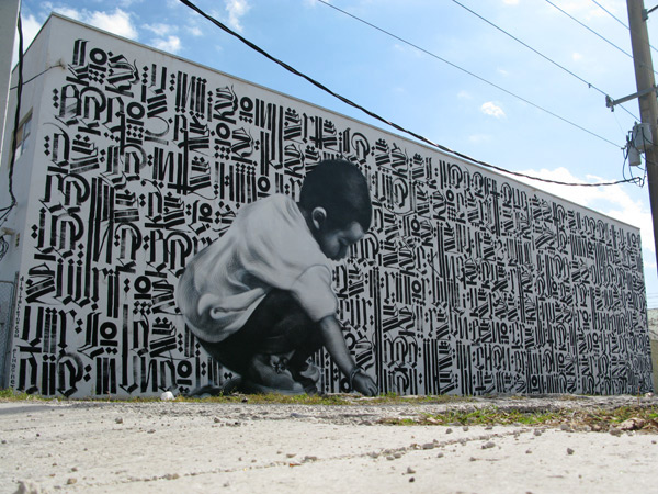 The larger-than-life sized boy painted by El Mac and Retna plays with the idea of scale. This is an example of the depth and size cue, "Relative Size" which tells us that the boy should be much smaller than he is. However, the image of the boy in relation to the artists standing next to the piece, or the telephone poles, provide conflicting information. These conflicting cues can cause excitement and/or confusion. There is also overlap being used by the artists to enhance the sense of dimension is the piece. The little boy appears to be kneeling in front of a wall (even though in reality, he is a part of the wall itself.) This helps the image look 3-D as opposed to 2-D. Furthermore, the boy is painted in large-scale and takes up more space and a greater field of view, making it seem as though he is extremely close to us. This enlargement of an image that we usually see as being smaller than us adds a sense of awe and is something we do not normally see. The artists succeed at creating a mural that is both provocative, and in-your-face. By using relative size, overlap, and scale, the artists produced a masterpiece that effectively demonstrate dimension, depth and space.
.jpg)

